> ## Documentation Index
> Fetch the complete documentation index at: https://docs.lovable.dev/llms.txt
> Use this file to discover all available pages before exploring further.
# Prompting best practices
> Plan before you prompt, build by component, use real content, and apply design buzzwords to get consistent, high-quality results.
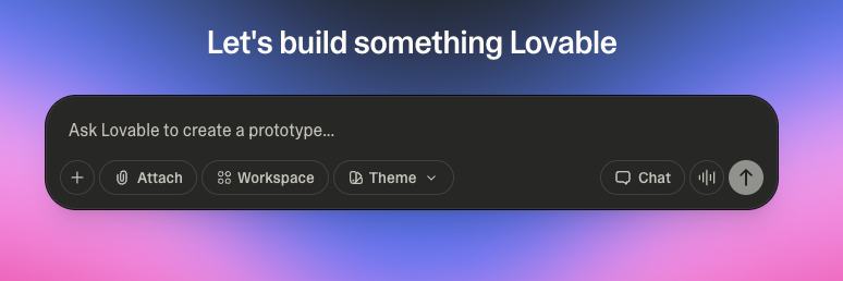 This playbook brings together the most effective techniques, strategies, and principles for getting the best possible results with Lovable. Whether you're new to prompting or ready to refine your skills, you'll find actionable advice and clear examples to help you turn ideas into polished UI quickly and consistently. For how these techniques fit into the full journey of building a product, see [How to build a real product with Lovable](/tips-tricks/from-idea-to-app).
## Make Lovable ask clarifying questions
One of the most effective ways to get better results is to let Lovable fill in the gaps before writing code. After stating what feature or change you want, add a line at the end of your prompt:
```text wrap theme={null}
Ask me any questions you need in order to fully understand what I want from this feature and how I envision it.
```
[Plan mode](/features/plan-mode) works especially well for this approach.
Lovable responds with focused, often insightful follow-up questions, sometimes ones you would not have thought to specify. Clarifying requirements up front prevents misunderstandings and wasted effort later, and new features land closer to your true intent with less back-and-forth.
## Phase 1: Lay the foundation
### Plan before you prompt
Before using Lovable, define what you're building. Skipping this step is like starting a painting without deciding what you're painting. Use a quick planning session, with pen and paper, voice notes, or ChatGPT, to answer four questions:
* What is this product or feature?
* Who is it for?
* Why will they use it?
* What is the one key action the user should take?
You're not writing a spec doc. You're setting direction. Vague ideas produce vague outputs, and clear thinking leads to clear results.
**Prompt example**
```text wrap theme={null}
Build a one-page site for a budgeting app targeted at Gen Z freelancers. The main CTA should be "Start Saving Smarter." Focus on a bold, expressive aesthetic with large text and punchy colors.
```
### Map the user journey visually
Design isn't about individual screens. It's about what happens between them, and the best outputs come from clear, logical flow. Map the journey your user takes from landing on the page to completing a key action.
Think in transitions:
* What does the user see first?
* What builds trust?
* What gives them confidence to act?
* Where does that action lead?
Even a simple three-step sketch (hero, features, call to action) makes your prompts far more effective.
You're not stacking blocks, you're guiding behavior. Every section should have a reason to exist, and a reason to lead to the next one.
### Get the design right first
Your visual language is a foundation, not a polish layer. Lovable needs to know the look and feel you want early. Otherwise, your interface might function but feel wrong, and design problems are harder to fix later than to decide up front.
Choose a direction, for example:
* Calm and elegant
* Bold and disruptive
* Premium and sleek
Then feed that style directly into your prompt using buzzwords, tone descriptors, and UI patterns. You can even create a starter style prompt and reuse it across all sections for consistency, or save it to your project [knowledge](/features/knowledge).
**Prompt example**
```text wrap theme={null}
Use a calm, wellness-inspired design. Soft gradients, muted earth tones, round corners, and generous padding. Font is "Inter". Overall tone should feel gentle and reassuring.
```
## Phase 2: Think in systems
### Prompt by component, not page
Lovable works best when you build your UI in modular parts, not full pages at once. Approach your prompts like building with Lego bricks: each block has one clear purpose and structure. A hero section, a feature grid, a testimonial slider, a pricing table. Build one, review it, refine it, then move to the next.
When you prompt by component, you gain clarity, control, and flexibility. If something doesn't look right, you fix just that block instead of re-prompting an entire page. Components can also be reused and adapted across pages without rewriting from scratch. A full-page prompt gets you noise. A section-based prompt gets you signal.
**Prompt example**
```text wrap theme={null}
Create a floating menu bar with glassmorphism effect. Include Home, Search, Music, Favorites, Add, Profile, and Settings icons. Add gentle floating animation and smooth hover interactions.
```
### Design with real content
Placeholder content like "lorem ipsum" or "feature 1 / feature 2" gives Lovable nothing to respond to. The fastest way to show intent is to use real words. Even if your final copy isn't ready, write copy that reflects your message: if you're building a page for a meditation app, write what a user would actually read.
Real content doesn't just produce better layouts and spacing, it helps you make smarter design decisions. A real headline might need two lines instead of one. A CTA might work better as a verb. Placeholder text hides those issues, and real content reveals them early.
**Prompt example**
```text wrap theme={null}
Hero section with headline: "Design Calmly." Subtext: "Turn stress into structure with Lovable." CTA: "Start Building Free." Use copy-centered layout with generous vertical spacing.
```
### Speak atomic: buttons, cards, modals
The smaller and more specific your UI language, the better Lovable performs. Instead of asking for a "section with a signup," say "add a form with an input field for email and a rounded CTA button." Describe cards, badges, toggles, chips, form fields, and dropdowns. Don't say "a user interface" when you can say "a modal with a success toast after submit."
This atomic vocabulary also lets you layer complexity gradually. Start with a card. Then add a badge. Then add hover states. Each layer builds naturally on the last, and you get more control and higher fidelity output without rewriting prompts.
**Prompt example**
```text wrap theme={null}
Create a card with a user profile picture, name, and a follow button. Add a badge for verified users, and show a tooltip when hovering over the badge.
```
### Use buzzwords to dial in aesthetic
Visual style is one of the most important, and most misunderstood, parts of prompting. It's not enough to describe layout. You need to convey the vibe, and buzzwords are the fastest way to do that.
Lovable understands terms like "minimal," "expressive," "cinematic," "playful," "premium," and "developer-focused." These aren't fluff: they meaningfully influence typography, spacing, shadow, border radius, and color palette. Use them early in your prompts, and ideally in every section, for cohesive designs that avoid the default-UI look.
You can also mix buzzwords to shift tone through a page. A hero can be "bold and disruptive" while the pricing section is "calm and reassuring." You're not stuck with one style, you're designing with intention.
**Prompt example**
```text wrap theme={null}
Design a landing page hero that feels premium and cinematic. Use layered depth, translucent surfaces, soft motion blur, and dramatic contrast between headline and background.
```
## Phase 3: Build with precision
### Use prompt patterns for layouts
Prompts are easier to write, and far more effective, when you use structured, repeatable patterns. Think of them as layout recipes: a good layout prompt breaks the section into visual parts, clarifies their order, and defines how they're styled. Most follow a header, content, action structure, adjusted to what you're designing.
Build a personal prompt library. Write a go-to structure for a feature grid, a testimonial slider, or a pricing table, then reuse and remix those patterns across pages. Lovable responds best to prompt language that is structured, scoped, and predictable.
**Prompt example**
```text wrap theme={null}
Create a feature section with a centered headline, followed by three horizontally aligned cards. Each card includes an icon on top, a headline, and a short description. Cards should have soft shadows and lift on hover.
```
### Add visuals via URL
Want your layout to feel real? Drop in product demos or hosted clips by URL. Lovable supports [video embeds](/features/projects/chat#add-images-and-videos-to-your-app) when prompted clearly. Prompt for placement (below the hero, inside a feature card), style (rounded corners, autoplay, muted), and context (why it's there).
**Prompt example**
```text wrap theme={null}
Embed a product demo video. Use this URL: https://cdn.midjourney.com/video/cb84f296-92a0-4a37-a0e3-1c9c95299488/0.mp4. Place it below the feature section in a full-width card with a soft shadow.
```
### Point at elements with the preview toolbar
When something specific needs to change, pointing beats re-prompting. Use the [preview toolbar](/features/preview-toolbar) to select the exact element and describe the change, instead of rewriting a full prompt and risking what already works. Plain text like a headline or a button label you can edit directly on the page.
Treat these edits as adjustments, not replacements. Select a CTA button and change just its copy, or tweak a card's layout without touching the section's typography. Be precise about what changes and what stays the same, using direction like "replace," "update," or "adjust" rather than "make this better."
**Prompt example (with an element selected)**
```text wrap theme={null}
Change the CTA button text to "Get Started" and increase the padding to 24px horizontal. Keep the existing background color and font.
```
## Phase 4: Iterate and ship
### Build with the backend in mind
Designing a layout is one part of building a product. If you want your project to do more than look good, think about how it will actually work, and the [built-in backend (Cloud)](/features/cloud) is the natural place to start. It handles user authentication, databases, storage, and edge functions, and Lovable shapes your UI to match these real behaviors right from the prompt.
When designing with the backend in mind, anticipate:
* **Auth logic**: what should the UI show when the user is logged in vs logged out?
* **Dynamic content**: are you pulling user data, posts, items, or metrics from a table?
* **States**: what happens if the data is empty, still loading, or fails?
You don't need a working backend during design. Shaping your UI as if it's already there is how you future-proof your layout.
**Prompt example**
```text wrap theme={null}
If the user is logged in, show their profile image and name in the top right. If not, display a "Log In" button and route them to the auth screen.
```
### Iterate with version history
Lovable saves every change to [version history](/features/projects/history) automatically, but autosave doesn't mean auto-organized. Make one meaningful change at a time: update the hero copy, add a feature grid, adjust the layout, check the result, then move forward. This is how real design systems are built, layer by layer, with intention.
Two habits keep iteration safe:
* **Bookmark milestones.** After each working state (layout locked, content added, logic wired), bookmark the version so you always have a known-good state to return to.
* **Preview before risky changes.** Before a big redesign, open the current version in history so you know what you're returning to if the experiment fails. Then prompt boldly, and revert freely.
This playbook brings together the most effective techniques, strategies, and principles for getting the best possible results with Lovable. Whether you're new to prompting or ready to refine your skills, you'll find actionable advice and clear examples to help you turn ideas into polished UI quickly and consistently. For how these techniques fit into the full journey of building a product, see [How to build a real product with Lovable](/tips-tricks/from-idea-to-app).
## Make Lovable ask clarifying questions
One of the most effective ways to get better results is to let Lovable fill in the gaps before writing code. After stating what feature or change you want, add a line at the end of your prompt:
```text wrap theme={null}
Ask me any questions you need in order to fully understand what I want from this feature and how I envision it.
```
[Plan mode](/features/plan-mode) works especially well for this approach.
Lovable responds with focused, often insightful follow-up questions, sometimes ones you would not have thought to specify. Clarifying requirements up front prevents misunderstandings and wasted effort later, and new features land closer to your true intent with less back-and-forth.
## Phase 1: Lay the foundation
### Plan before you prompt
Before using Lovable, define what you're building. Skipping this step is like starting a painting without deciding what you're painting. Use a quick planning session, with pen and paper, voice notes, or ChatGPT, to answer four questions:
* What is this product or feature?
* Who is it for?
* Why will they use it?
* What is the one key action the user should take?
You're not writing a spec doc. You're setting direction. Vague ideas produce vague outputs, and clear thinking leads to clear results.
**Prompt example**
```text wrap theme={null}
Build a one-page site for a budgeting app targeted at Gen Z freelancers. The main CTA should be "Start Saving Smarter." Focus on a bold, expressive aesthetic with large text and punchy colors.
```
### Map the user journey visually
Design isn't about individual screens. It's about what happens between them, and the best outputs come from clear, logical flow. Map the journey your user takes from landing on the page to completing a key action.
Think in transitions:
* What does the user see first?
* What builds trust?
* What gives them confidence to act?
* Where does that action lead?
Even a simple three-step sketch (hero, features, call to action) makes your prompts far more effective.
You're not stacking blocks, you're guiding behavior. Every section should have a reason to exist, and a reason to lead to the next one.
### Get the design right first
Your visual language is a foundation, not a polish layer. Lovable needs to know the look and feel you want early. Otherwise, your interface might function but feel wrong, and design problems are harder to fix later than to decide up front.
Choose a direction, for example:
* Calm and elegant
* Bold and disruptive
* Premium and sleek
Then feed that style directly into your prompt using buzzwords, tone descriptors, and UI patterns. You can even create a starter style prompt and reuse it across all sections for consistency, or save it to your project [knowledge](/features/knowledge).
**Prompt example**
```text wrap theme={null}
Use a calm, wellness-inspired design. Soft gradients, muted earth tones, round corners, and generous padding. Font is "Inter". Overall tone should feel gentle and reassuring.
```
## Phase 2: Think in systems
### Prompt by component, not page
Lovable works best when you build your UI in modular parts, not full pages at once. Approach your prompts like building with Lego bricks: each block has one clear purpose and structure. A hero section, a feature grid, a testimonial slider, a pricing table. Build one, review it, refine it, then move to the next.
When you prompt by component, you gain clarity, control, and flexibility. If something doesn't look right, you fix just that block instead of re-prompting an entire page. Components can also be reused and adapted across pages without rewriting from scratch. A full-page prompt gets you noise. A section-based prompt gets you signal.
**Prompt example**
```text wrap theme={null}
Create a floating menu bar with glassmorphism effect. Include Home, Search, Music, Favorites, Add, Profile, and Settings icons. Add gentle floating animation and smooth hover interactions.
```
### Design with real content
Placeholder content like "lorem ipsum" or "feature 1 / feature 2" gives Lovable nothing to respond to. The fastest way to show intent is to use real words. Even if your final copy isn't ready, write copy that reflects your message: if you're building a page for a meditation app, write what a user would actually read.
Real content doesn't just produce better layouts and spacing, it helps you make smarter design decisions. A real headline might need two lines instead of one. A CTA might work better as a verb. Placeholder text hides those issues, and real content reveals them early.
**Prompt example**
```text wrap theme={null}
Hero section with headline: "Design Calmly." Subtext: "Turn stress into structure with Lovable." CTA: "Start Building Free." Use copy-centered layout with generous vertical spacing.
```
### Speak atomic: buttons, cards, modals
The smaller and more specific your UI language, the better Lovable performs. Instead of asking for a "section with a signup," say "add a form with an input field for email and a rounded CTA button." Describe cards, badges, toggles, chips, form fields, and dropdowns. Don't say "a user interface" when you can say "a modal with a success toast after submit."
This atomic vocabulary also lets you layer complexity gradually. Start with a card. Then add a badge. Then add hover states. Each layer builds naturally on the last, and you get more control and higher fidelity output without rewriting prompts.
**Prompt example**
```text wrap theme={null}
Create a card with a user profile picture, name, and a follow button. Add a badge for verified users, and show a tooltip when hovering over the badge.
```
### Use buzzwords to dial in aesthetic
Visual style is one of the most important, and most misunderstood, parts of prompting. It's not enough to describe layout. You need to convey the vibe, and buzzwords are the fastest way to do that.
Lovable understands terms like "minimal," "expressive," "cinematic," "playful," "premium," and "developer-focused." These aren't fluff: they meaningfully influence typography, spacing, shadow, border radius, and color palette. Use them early in your prompts, and ideally in every section, for cohesive designs that avoid the default-UI look.
You can also mix buzzwords to shift tone through a page. A hero can be "bold and disruptive" while the pricing section is "calm and reassuring." You're not stuck with one style, you're designing with intention.
**Prompt example**
```text wrap theme={null}
Design a landing page hero that feels premium and cinematic. Use layered depth, translucent surfaces, soft motion blur, and dramatic contrast between headline and background.
```
## Phase 3: Build with precision
### Use prompt patterns for layouts
Prompts are easier to write, and far more effective, when you use structured, repeatable patterns. Think of them as layout recipes: a good layout prompt breaks the section into visual parts, clarifies their order, and defines how they're styled. Most follow a header, content, action structure, adjusted to what you're designing.
Build a personal prompt library. Write a go-to structure for a feature grid, a testimonial slider, or a pricing table, then reuse and remix those patterns across pages. Lovable responds best to prompt language that is structured, scoped, and predictable.
**Prompt example**
```text wrap theme={null}
Create a feature section with a centered headline, followed by three horizontally aligned cards. Each card includes an icon on top, a headline, and a short description. Cards should have soft shadows and lift on hover.
```
### Add visuals via URL
Want your layout to feel real? Drop in product demos or hosted clips by URL. Lovable supports [video embeds](/features/projects/chat#add-images-and-videos-to-your-app) when prompted clearly. Prompt for placement (below the hero, inside a feature card), style (rounded corners, autoplay, muted), and context (why it's there).
**Prompt example**
```text wrap theme={null}
Embed a product demo video. Use this URL: https://cdn.midjourney.com/video/cb84f296-92a0-4a37-a0e3-1c9c95299488/0.mp4. Place it below the feature section in a full-width card with a soft shadow.
```
### Point at elements with the preview toolbar
When something specific needs to change, pointing beats re-prompting. Use the [preview toolbar](/features/preview-toolbar) to select the exact element and describe the change, instead of rewriting a full prompt and risking what already works. Plain text like a headline or a button label you can edit directly on the page.
Treat these edits as adjustments, not replacements. Select a CTA button and change just its copy, or tweak a card's layout without touching the section's typography. Be precise about what changes and what stays the same, using direction like "replace," "update," or "adjust" rather than "make this better."
**Prompt example (with an element selected)**
```text wrap theme={null}
Change the CTA button text to "Get Started" and increase the padding to 24px horizontal. Keep the existing background color and font.
```
## Phase 4: Iterate and ship
### Build with the backend in mind
Designing a layout is one part of building a product. If you want your project to do more than look good, think about how it will actually work, and the [built-in backend (Cloud)](/features/cloud) is the natural place to start. It handles user authentication, databases, storage, and edge functions, and Lovable shapes your UI to match these real behaviors right from the prompt.
When designing with the backend in mind, anticipate:
* **Auth logic**: what should the UI show when the user is logged in vs logged out?
* **Dynamic content**: are you pulling user data, posts, items, or metrics from a table?
* **States**: what happens if the data is empty, still loading, or fails?
You don't need a working backend during design. Shaping your UI as if it's already there is how you future-proof your layout.
**Prompt example**
```text wrap theme={null}
If the user is logged in, show their profile image and name in the top right. If not, display a "Log In" button and route them to the auth screen.
```
### Iterate with version history
Lovable saves every change to [version history](/features/projects/history) automatically, but autosave doesn't mean auto-organized. Make one meaningful change at a time: update the hero copy, add a feature grid, adjust the layout, check the result, then move forward. This is how real design systems are built, layer by layer, with intention.
Two habits keep iteration safe:
* **Bookmark milestones.** After each working state (layout locked, content added, logic wired), bookmark the version so you always have a known-good state to return to.
* **Preview before risky changes.** Before a big redesign, open the current version in history so you know what you're returning to if the experiment fails. Then prompt boldly, and revert freely.